An Introduction to Photo Editing with PhotoLine: Basic Concepts
Document vs. picture
In PhotoLine, simple graphics are pictures. Documents may contain many pictures; an example would be a brochure. And documents may consist of multiple pages. For photo editing, we are going to focus on pictures.
Somewhat confusingly, what are called the Document panels show the attributes and list of pictures as well as documents; if a document’s mode is listed as Mode: Picture Mode, it is a picture.
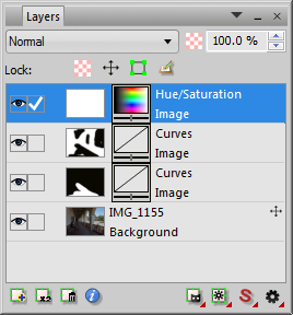
Layers
The first layer in a picture is always an image layer. This layer is called the background layer and defines the size of the picture, as well as having some other special properties. Layers may be added on top of the background, including additional image layers, text layers, and adjustment layers. They may each have their own size, position, and opacity. We will spend most of our time on adjustment layers.
|
When resizing, setting or changing color profiles, or converting between image types, one may be offered a choice between Layer, Page, and Document. If Layer is selected, the changes will be applied only to the active layer, which may not be what is intended. Page refers to the active page of a document, and Document to the entire document (which for us will be a picture). Most importantly, the latter two apply to all of the layers in the current picture.
Adjustment layers
These are the workhorses of image editing. They adjust things like luminance, contrast, and color saturation, but non-destructively; they are just a set of instructions that are applied to the image. After creating an adjustment layer, you may go back and adjust it some more if you change your mind. The two you will probably use the most are Curves and Hue/Saturation.
Layer masks
These make adjustment layers especially powerful. If you want to darken just the sky, for example, you would use curves to make the adjustment. But the adjustment is applied to the entire image by default, so you would mask the foreground using the layer’s mask; the adjustment would then be applied only to the sky.
Color filters
Any layer may be blended with its background based on luminance, hue, saturation, or an RGB value, using color filters (sometimes called the “blend if” function, or a “blend range”). This allows for finer control when you want to darken a specific area such as a window, or change the color balance of a certain tonal range such as the highlights.
Color vs. luminance
Most images that one encounters are RGB, meaning that red, green, and blue channels are combined to create the colors that you see on the display. (Other options include grayscale, which PhotoLine calls “gray,” and CMYK, for cyan, magenta, yellow, and black, which is intended for printing.) When editing an RGB image in what is called Normal blend mode, the three color channels are adjusted together. This may or may not be the best way to do it, because even if you just want to adjust the brightness or contrast, the color will probably change as well, and vice versa. There are several ways to prevent this; one is to use either the Luminance or Color blend mode for adjustment layers. Another, which will be discussed further, is to make adjustments using image modes other than RGB. (It is not difficult, and PhotoLine excels at this.)
More color terms that we will use include hue and saturation (subsumed above as “color”). Hue refers to “what color” an object is, such as red, yellow, green, etc. Saturation (a related and probably more accurate term is “chroma”) refers to how intense the color is. A stop sign and a brick may both be the same hue (red), but the stop sign is more saturated than the brick. “Day-glo” colors stand out because they are intensely saturated; gray is completely unsaturated.
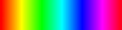
hue gradient |

saturation gradient |
As a general principle, separating color from luminance in your mind is a useful skill to develop.
Bit depth
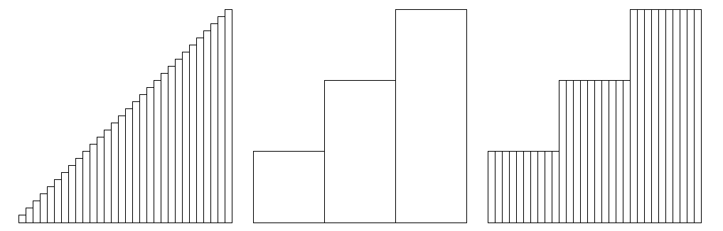
Image files store color information as numbers. Each pixel of an RGB image, for example, consists of a number for each of the red, green, and blue channels. These numbers range from 0 to a predefined maximum. The image file must allocate a certain amount of information, measured in bits, for each number. The number of bits per channel is referred to as the bit depth. Standard displays, and .jpg files, use 8 bits per channel; each channel is expressed as a number from 0 to 255 (256, or 28, values in all), for a total of
 |
 |
If you can, always start with 16-bit images, which use 216, or 65,536, values per channel. 16-bit color gradations consist of much finer steps than 8-bit, and can tolerate more pushing and pulling during image editing without visually separating. You need to start with a high-bit capture for this to work. You can convert an 8-bit image to 16-bit, but this only refers to the number of possible colors; if there are only 256 values per channel to begin with, converting the image to 16-bit does not increase the number of colors in the image, and editing will still produce banding. Grayscale images have an even greater need for 16 bits; since there is only one channel, an 8-bit grayscale gradient can only have 256 values.
Today’s digital cameras generally capture raw images (and sometimes .tifs) as either 12 or 14-bit; converted to conventional 16-bit images, they are generally sufficient for photo editing. Saving the image as a .pld or .tif will preserve the bit depth. If you capture or save the images as .jpgs, you are stuck with 8-bit.
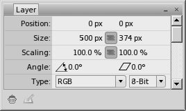
PhotoLine specifies bit depth for each layer in a picture. The image layers are the ones where 16 bits are most important. The bit depth for an adjustment layer refers to the (grayscale) mask, and 8 bits are often plenty for this purpose; but this may not be the case for fine gradients such as the sky.
(Just to confuse you, 3 channels at 8 bits per channel is sometimes referred to as 24-bit.)
Side note: this is what happens when you convert from 16-bit to 8 then back to 16 (imagine that there are actually 256 small steps per large step):
 |
Assigning/Setting/Tagging vs. Converting Color Profiles
Two menu items under Tool – Color are Set Color Profile and Convert With Color Profile. An image file should be assigned a color profile just one time, preferably at the time of its creation, or else when opening a file without an assigned profile. Setting a profile does not change the image pixels; it only adds instructions for what profile to display the image with, and may or may not embed the profile in the image file so it is always available. Converting an image to a different color profile changes the image pixels so that the image will look the same, within the limitations of the gamut, when displayed with the new profile. For example, an image in a large color space such as ProPhoto RGB or Adobe RGB should be converted to sRGB for display in a web browser. Or an image in another color space such as Lab may be converted to RGB using a specific profile. Note that adjustment layers may behave differently when using different color profiles; the conversion should be performed on a flattened copy of the original image.
Opening an image
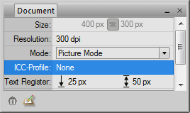
File – Open, or Open Recent. Or, right click the image file, Open with PhotoLine.
Look at the Document panel to see the image’s ICC profile, or none as the case may be. If none, set one by double-clicking the ICC-Profile entry on the Document panel, or via Tool – Color – Set Color Profile (NOT Convert With Color Profile), making sure Page or Document is selected. If unsure, use sRGB. At this stage, Rendering Intent should probably be Perceptual.
 |
 |
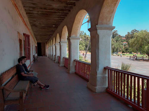
If an image has no assigned profile, its colors may appear bizarre if its intended color profile is different from the default set in the Color Management dialog. For example, the first image below started out identical to the second in the sRGB color space, but had no assigned profile when it was opened using ProPhoto RGB as the default. This is why every image should have an assigned color profile.
 |
 |
Saving an image
We are going to look at two ways of saving an image: File – Save as, and Web – Web Export.
PhotoLine uses some unique methods for adjusting images, such as masks for layer masks. The only way to save an image as-is, with all of its layers and properties intact, is via File – Save as – PLD: PhotoLine Document. But note that PhotoLine may be the only application that can reopen it. Even if you also save the image in another format as described below, save the master file as a PLD.
If you need to open the image in another application, save it as a TIF for compatibility; but note that the adjustment layers will no longer be adjustable. To save just the final image, such as for printing, use Layer – Flatten Image to merge all the layers, then save as a TIF.
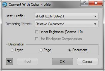
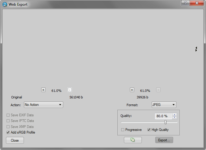
To save for the web, use Web – Web Export, choose JPEG for conventional photographs, and adjust the quality to taste; higher quality means a larger image file. For general purposes, 80% usually works. Web images should all use the sRGB profile or an equivalent as this is what browsers use; if the image has a different profile, first flatten the image and convert it to sRGB via Tool – Color – Convert With Color Profile (NOT Set Color Profile), making sure Page or Document is selected. Compare Perceptual and Relative Colorimetric to see if there is a preference. Select Add sRGB Profile on the Web Export dialog.
 |
|
Undoing actions
Edit – Undo. Or, use the Undo List panel to go way back, then forward again if desired.
Next: the toolbox
